MA121 Study Guide
Unit 1: Statistics and Data
1a. Describe types of sampling methods for data collection
- What is the difference between a population and a sample?
- What is the definition of bias and inferential data?
- How can researchers control for possible bias in samples?
- What is the definition of a sample and sample size?
- What are the definitions of the three types of sampling: stratified, cluster, and systematic?
A population is everyone we would like to collect data about. For example, if we study the voting habits of 20- to 25-year-olds in the US, we see that the population would be every 20- to 25-year-old in the US. However, it is not always practical or even possible to collect data from every single person we are trying to study, so we collect a sample. A sample is a subset of the population we use to draw conclusions about the entire population. A sample size is the number of data points or people in your sample.
Bias (systematic error that causes results to consistently deviate from the true value or misrepresent the population being studied) occurs when we deal with inferential statistics. For example, because we cannot practically consider every person in the United States as part of our dataset, we have to ensure our sample represents the entire population.
A common example of how things can go wrong is the 1936 US presidential election, when political polling was brand new. The Literary Digest magazine mailed thousands of survey cards to its readers and people, which it found in the phone book and car registration directory, to poll whether Republican challenger Alf Landon would defeat the Democratic incumbent Franklin D. Roosevelt. The responses predicted Landon would win in a landslide. What went wrong?
Their sample size was large enough, and their mathematical calculations were probably correct. However, in 1936, phones, cars, and even magazine subscriptions were considered luxury items. The magazine's sample disproportionately represented wealthier Americans who were more likely to vote Republican.
While it is difficult to eliminate sampling bias entirely, we can use different sampling methods to reduce it.
- Stratified sampling divides the population into sub-populations and takes a random sample of each group. For example, if you think Democrats, Republicans, and Independents will poll differently on an issue, and these groups each represent 30, 25, and 45 percent of the entire US population, your sample should reflect the same proportion of representatives. You should choose 30 Democrats, 25 Republicans, and 45 independents at random and send the survey form to all of these 100 individuals.
- Researchers use cluster sampling when their population is already divided into representative groups. For example, a researcher might study buildings (or clusters) in an apartment complex, choose a certain number of buildings at random, and sample everyone in each building.
- Researchers use systematic sampling when they have a rough idea of population size but lack a representative cluster to sample. For example, a researcher might poll every tenth person who walks through the door in a shopping mall, or an inspector might examine every 20th item on an assembly line for quality.
Review
To review, see:
1b. Interpret frequency tables
- What is a frequency table?
- What are the definitions of class, bin, and class intervals?
- What is the definition of an outlier?
- Why is it important to include every possible value between the lowest and highest on the left side of a frequency table, even when that value is not represented or has no frequency? In other words, if the data you obtain from an experiment ranges from 1 to 5 and there are no 4s, why do you need to display a row for 4?
- What do you do when there are too many values in a data set to give each variable its own row? Let's say the variable is yards rushing during a football game, and the possible values are 51 to 218. Your space does not allow you to display more than 160 rows in your table. What do you do?
A frequency table lists every possible value of the random variable (every possible value) in a data distribution. It must include an interior value, even when that data point has no frequency. This is because one of the purposes of a frequency table is to display how varied the data is.
For example, if our values are 1, 2, 3, and 25, you should space the 25 so it is 22 points away from the three to illustrate how much of an outlier it is. You should include rows for 4 to 24, with a zero frequency for each.
If the distribution has too many possible values, you can group the values into class intervals (sometimes called classes or bins) and mark the frequency for each.
Let's return to our football example. You can display the number of players who have rushed 50 to 59 yards, 60 to 69 yards, and so on. If you treat this data as discrete, it will be a long, tedious table with mostly ones and zeros since you would need to show the number of players who rushed 50 yards, the number of players who rushed 51 yards, the number of players who rushed 52 yards, and so on. Grouping or organizing the figures into classes of ten yards each is more concise and gives the reader a more comprehensive picture of the total data.
If you group your data into classes, make sure:
- Each class is the same width,
- Each class does not overlap, and
- Each class accounts for every possible value.
For example, we could use 50 to 59 yards, 60 to 69 yards, and so on. Each class width would equal ten rushing yards. We should not use 50 to 55 yards, 56 to 70 yards, or 71 to 73 yards.
Note that we are assuming the measurements are in whole yards. If we had a measurement of 55.3 in the above grouping, we would violate our third rule (that each class accounts for every possible value) since 55.3 comes between two classes. So you may have to group your data as 50 to 55, 55 to 60, and so on, so you would put 55.5 and even 55.99 in the first class or bin.
Your decision on how wide to make your class interval and how many intervals to include is a matter of personal preference. The course refers to formulas like Sturges' Rule and Rice Rule, which are easy to compute (the number of intervals equals the cube root of the number of observations). However, you may need to make some adjustments since your result will probably not be a whole number (integer).
Do not worry too much about memorizing these rules since statisticians do not even agree on which rule is best. Researchers generally recommend using 5 to 20 class widths, but this can vary depending on whether your data is homogenous or heterogenous. It might be a good strategy to put your data in groups of tens so you can classify each data point by its first digit.
If you have too few classes, your readers may not appreciate the diversity of your data. If you have too many classes, you will probably display many ones and zeros, which can become tedious for the reader. Experiment with a few options until you see one that makes sense to you and your audience.
Review
To review, see:
1c. Display data graphically in stem plots, histograms, boxplots, and scatterplots
- What is the definition of a histogram? How does it differ from a bar graph? What are some rules for drawing histograms that do not apply to bar graphs?
- How is a stem plot similar to and different from a histogram?
- What is a dot plot?
- What does a boxplot represent graphically?
- What is a scatterplot, and how is it different from the other three graphs discussed here?
A histogram is a special type of bar graph that researchers use to display quantitative distributions. A histogram differs from a bar graph because the horizontal axis is numeric: the horizontal axis of a bar graph represents qualitative data, and the vertical axis represents the frequency.
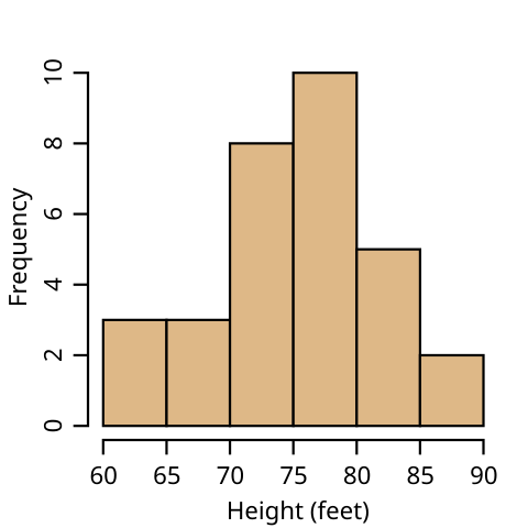
A histogram should follow the same three rules for frequency tables listed above. The numbers on the horizontal axis need to be in order if they are grouped into classes. This makes it easy for readers to recognize any data point that is an outlier (a data value that is significantly different from the other values in the dataset) due to the distance of the outlier's bar from the other bars in the graph. You must include any data point or interval that has zero values with no bar. For consistency, data that is homogenous (or heterogenous) is organized in the same way on the histogram. Remember that a histogram's main purpose is to represent a frequency table graphically.
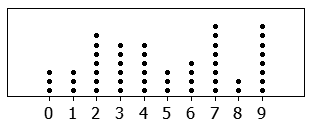
A stem plot (also called a stem-and-leaf plot) is similar to a histogram, except it includes the last digit of the actual data values (the leaves) above the stem of the first digit or digits. Researchers use a stem plot to display the actual data on their graph. Stem plots quickly convey the minimum, maximum, and median of the data points to their readers.
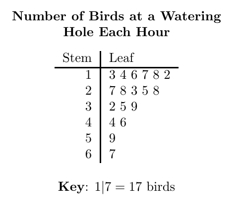
A stem plot is similar to a dot plot, which uses dots or similar markings to represent data points. For example, if the bar height (frequency) of the histogram is seven, and the values are 50, 51, 52, 54, 55, 56, and 59, the histogram will display a bar that is seven units high. A dot plot will have seven dots going up from the horizontal axis, and a stem plot will have "five" in the stem, with the digits 1, 2, 4, 5, 6, and 9 written out to the right.
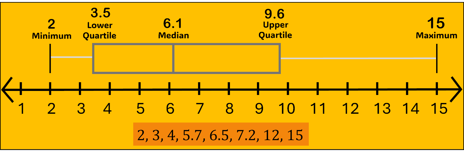
A box plot graphically displays the five-number summary of a data set. The five numbers are the minimum, first quartile, median, third quartile, and maximum. Think of the first and third quartiles as the median of the lower and upper halves of the distribution, respectively. In other words, the five numbers partition the data set into four quartiles, each with (roughly) the same number of data points.
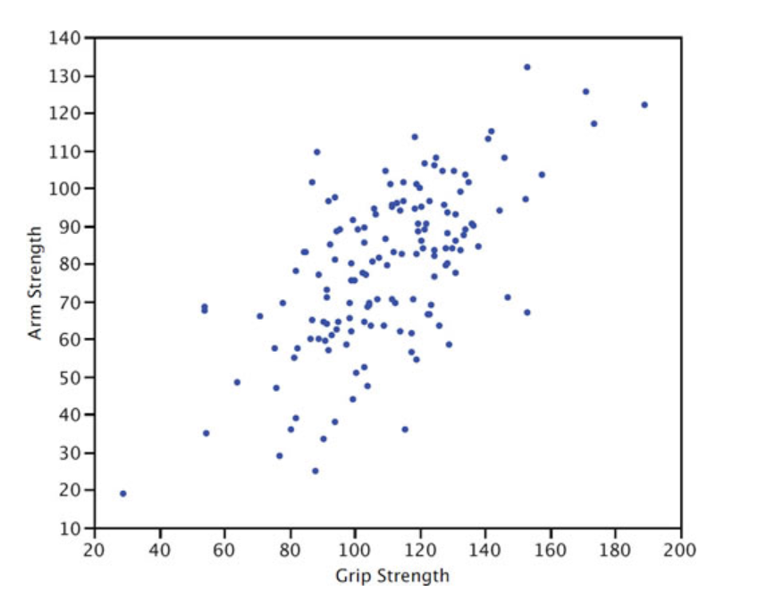
A scatterplot is a graph that shows the relationship between two variables. The scatterplot below shows the arm strength compared to grip strength. Each dot represents one person.
Review
To review, see:
1d. Calculate measures of the location of data: quartiles and percentiles
- What is a percentile, and how is it related to or different from a quartile?
- What is the relationship between quartiles and the median?
- What is the five-number summary?
- A calculator and Excel might give two numbers for the 1st and 3rd quartiles. Why is that?
The Pth percentile of a data set means that P% of the data falls below that number and (100−P)% falls above that number. For example, the 80th percentile is the number where 80% of the data is below and 20% is above. The median (half the data below, half above) is also the 50th percentile. These are approximate, especially for small data sets. This is because, for example, if you have 20 data points, finding the 37th percentile will not be an exact number. Since there are only 20 numbers (assuming no repeats), you'll have a 35th percentile; the next number will be the 40th.
The quartiles of a data set divide that data set into four roughly equally sized (number of data points) parts. Again, we say "roughly" because if the number of data points is small and not a multiple of 4 (17 data points, for example), you will not get four quartiles of the same size. This is another reason why finding quartiles is approximate.
When you have large data sets (100 or more), you can find theoretical percentiles using the Normal Distribution (see Unit 2). The median is the same thing as the 2nd quartile. The 1st quartile divides the first half of the data in half, and the 3rd quartile splits the upper half of the data. The minimum, 1st quartile, median/2nd quartile, 3rd quartile, and maximum make up the boundaries of the four quarters of data and are referred to as the five-number summary.
Finding quartiles for small data sets can be tricky and even subjective if the number of data points is not a multiple of four. In the set: {0, 3, 4, 6, 8, 11, 11, 13, 15, 17, 20, 25}, the median is 11, the first quartile (separating the 3rd and 4th point) is 5, and the third quartile (separating the 9th and 10th point) is 16. This is relatively simple because we have 12 data points and can evenly divide them into groups of 3: {0, 3, 4 || 6, 8, 11 || 11, 13, 15 || 17, 20, 25}.
However, let's say we have 15 data points: {1, 3, 4, 5, 7, 8, 10, 10, 11, 13, 15, 16, 19, 20, 25}. The 2Q/median is the 8th data point (10). What about the 1st quartile? If we include the median, the first half is {1, 3, 4, 5, 7, 8, 10, 10}, and the 1st quartile (the median of this set) is 6. If we exclude the median {1, 3, 4, 5, 7, 8, 10}, then the 1st quartile is 5. That is why different technologies may give you different answers. Which is correct? Well, both. Even Microsoft Excel has two different functions for quartiles: inclusive and exclusive. This discrepancy disappears as the data set gets very large.
Review
To review, see:
1e. Calculate measures of the center of data: mean, median, and mode
- What are the differences between the mean and the median?
- What does the center of distribution tell us?
- When is the median a better measure of center than the mean?
- When is the mode preferable to the mean or median?
We calculate the mean by adding all the data points and dividing the result by the size. The mean provides a rough idea of the center of the distribution. The median does this, too, but disregards all data points except for the one or ones in the middle.
You can think of the median (the middle value in a dataset when all values are arranged in order from lowest to highest) as more resistant to outliers. In other words, when a researcher adds a significantly higher or lower value to a data set, or if the data is right or left-skewed, the mean will adjust accordingly, with a significant upward or downward effect. To be skewed means the data distribution is asymmetrical, with values concentrated more on one side and a tail extending toward the other. Conversely, the median disregards the high and low values, so adding extreme values will have a much smaller (if any) effect on the median.
The mode conveys the most common data type. It differs from the mean and median because it is the only measure of center we can use with qualitative data since it does not require a calculation or computation.
Review
To review, see:
1f. Calculate measures of the spread of data: variance, standard deviation, and range
- Why is range generally not a reliable measure of spread?
- Why are measures of spread necessary? What critical information does the measure of center fail to provide?
- What is the difference between variance and standard deviation?
Measures of spread are just as important as measures of center. The mean and median, for quantitative data, give us an idea about where the center of the distribution is.
The variance and standard deviation tell us about the spread of the data or how varied or heterogeneous your data is. A variance of zero happens if all data points are equal. For example, the data sets {49, 50, 51} and {0, 50, 100} have the same mean and median (50), but the second set is much more varied. We quantify this variability with the measure of spread.
The variance equals the mean of the squared differences between each data point and the mean.
The standard deviation equals the square root of the variance. One of the reasons we compute this is to get the units back to the original data set. If the data points are in minutes, the unit for the variance would be "square minutes", which does not make sense.
The simplest measure to use is the range (maximum to minimum), but the range is generally not a good measure since it only considers the highest and lowest data points.
Consider Data Set A={47,48,49,50,51} and Data Set B={47,48,49,50,51,100}.
The range goes from four to 53. Set B is certainly more varied, but the 100 is an outlier, so the change in standard deviation is less extreme. The standard deviation is 1.6 for set A and 20.9 for set B.
Review
To review, see:
1g. Describe the differences between independent and dependent variables, discrete and continuous variables, and qualitative and quantitative variables
- What is the difference between descriptive and inferential statistics?
- How do quantitative and qualitative data differ?
- What are discrete and continuous data, and how do they differ as types of quantitative data?
- What is the difference between independent and dependent variables?
Descriptive statistics provide facts about a data set, which are often depicted in a graph. Where is the data centered? What is the mean? What is the median? Are the data centered or bell-shaped, meaning they form a symmetrical curve where most values cluster around the center and taper off equally on both sides? Is the distribution curved, showing a peak and then gradually decreasing, but not necessarily in a symmetrical way? Are the data skewed to the right or left? In other words, do most values appear at one end of the graph? These descriptions tell us facts about the data in front of us and our chosen population or sample.
Inferential statistics refers to how we draw conclusions about a population of data when we examine data in a sample. Inferential statistics is the more common method of statistics since we rarely have the time or resources to survey or measure every item, member, or person in a given group or population. In statistics, differences among various data types are important since they determine which tests or graphs are most useful for displaying data and answering certain questions.
Quantitative data (or numeric data) describes numeric or mathematical data. We use quantitative data to calculate sums, averages, means, other types of statistics, and other mathematical operations.
Qualitative data (or categorical data) describes non-numeric data. Qualitative data includes text, letters, and words. Qualitative data can also include numerical digits, but mathematical operations do not make sense or may be impossible in this usage.
For example, consider a phone number, zip code, or postal code. Although these designations consist of numerical digits (numbers) and may include dashes and parentheses, we do not use them to conduct calculations. We do not add or calculate an average for the numbers in our telephone contact list or postal code. Phone numbers, zip codes, and postal codes are examples of qualitative data.
We can categorize quantitative data further as discrete or continuous data.
A discrete data set contains a fixed or small number of possible values. The classic example of a discrete data set is a six-sided die. You can only roll a one, two, three, four, five, or six. You cannot roll a 2.8.
A continuous data set has a large or infinite number of possibilities. Consider the weight of a group of college students. When we discard extreme outliers, our range may be from 120 to 200 pounds. This dataset includes 61 possible values, assuming we measure while rounding to the nearest pound. When a 285-pound football player enters our dataset, we must add 85 possibilities to account for 166 possible values because the dataset is continuous. Although this number is not infinite, it is impractical to consider it as discrete data, as we will review in the next learning outcome.
Independent variables are the variables researchers manipulate to see if they affect the dependent variable. For example, if we are studying a new diet pill for weight loss, we could give half of the rats in our study a new one. Then, we would record any weight change in the two groups of rats. The diet pill would be the independent variable, while the weight change would be the dependent variable.
Review
To review, see:
1h. Explain what information Pearson's correlation coefficient gives about the dataset
- What does Pearson's correlation coefficient measure?
- What are the possible values for Pearson's coefficient?
Pearson's correlation coefficient measures the strength of the linear relationship between two variables. This coefficient can range from -1 to 1. A -1 would represent a perfect negative relationship between the two variables, while a coefficient of 1 would represent a perfect positive relationship. Consider the number of hours someone spends running and their cardio fitness. We would expect this to be a positive relationship. At the same time, we would expect that more hours watching TV would negatively affect test scores. A correlation of 0 would mean there is no linear relationship between the two variables.
Review
To review, see:
Unit 1 Vocabulary
This vocabulary list includes terms you will need to know to successfully complete the final exam.
- bias
- box plot
- class interval
- cluster sampling
- continuous data
- dependent variable
- descriptive statistics
- discrete data
- dot plot
- frequency table
- histogram
- independent variable
- inferential statistics
- mean
- median
- mode
- outlier
- Pearson's correlation coefficient
- population
- qualitative data
- quantitative data
- quartile
- range
- sample
- sample size
- scatterplot
- skewed
- standard deviation
- stem plot
- stratified sampling
- systematic sampling
- variance